
About Steve
With over 8 years of increasing experience in marketing, creative direction, and design leadership, Steve is a big-picture creative professional focused on unifying concepts and leading teams in successful and impactful creative marketing.
With a passion for mentoring and leading junior and mid-level creatives, Steve is supportive, inspiring, and motivating; he is passionate about finding creative ways to tell your story beautifully and effectively.
Work
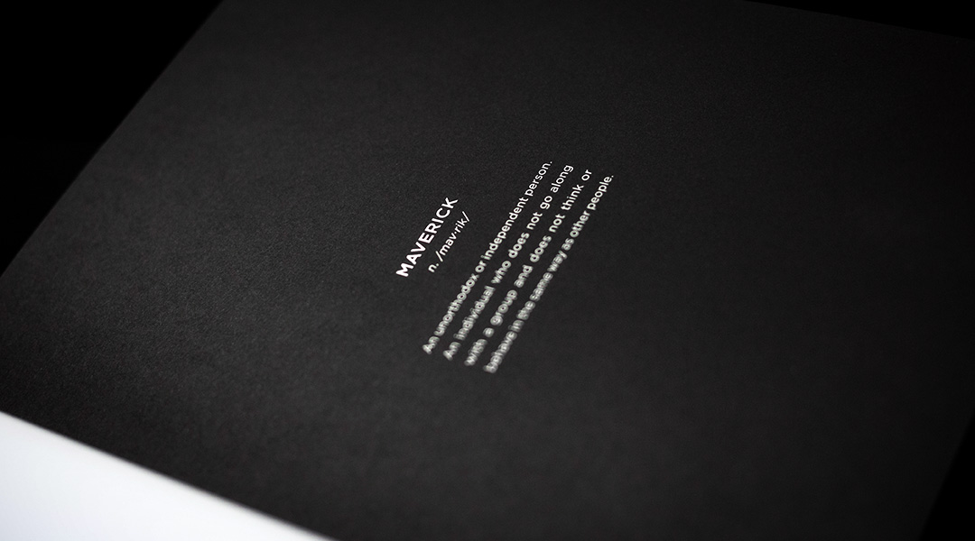
The Maverick
Branding, Marketing Campaign
Empire Maverick
Branding, Identity, Event Series & Comprehensive Campaign
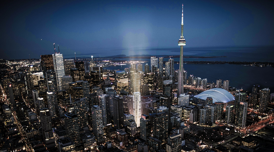
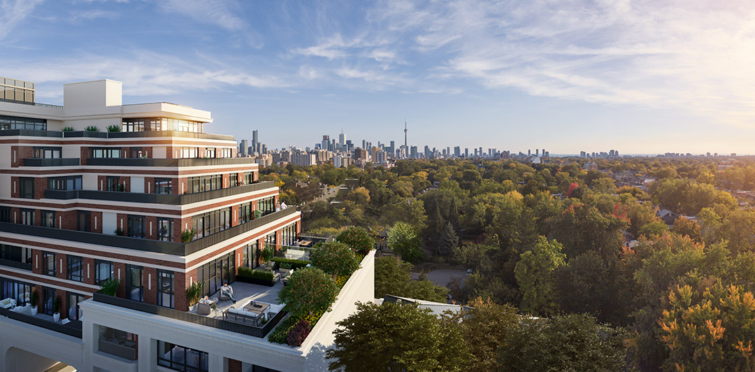
The brief for real estate developer Empire Communities' King Street high-rise condominium project was to create an iconic identity for the coveted Toronto locale. With this project representing Empire's return to the downtown Toronto high-rise market, creating an impactful, memorable, and versatile brand was paramount.
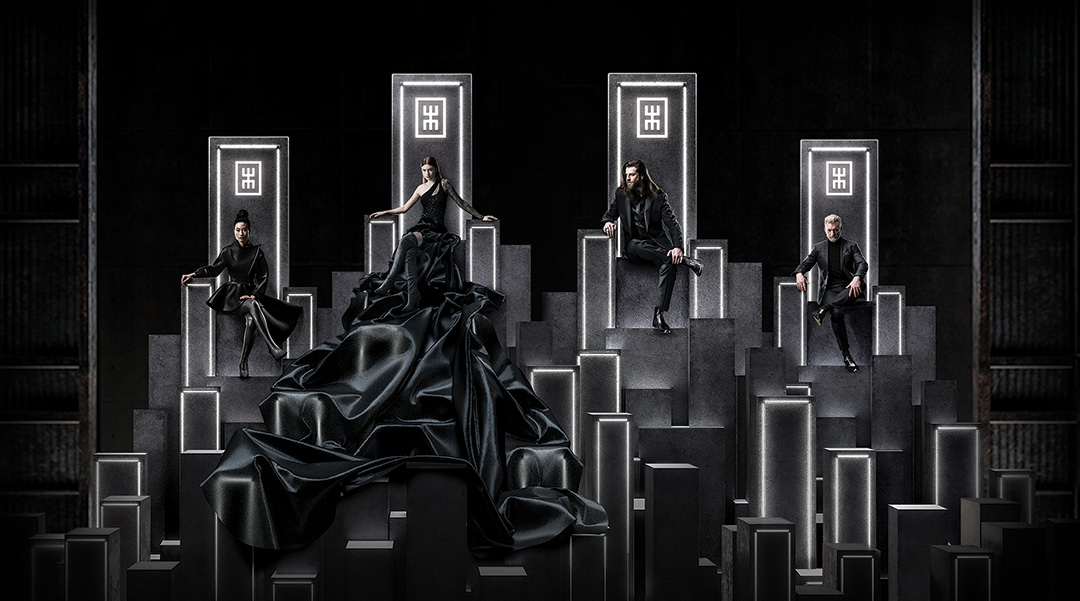
The Mavericks
Breaking the mold of traditional marketing, internal marketing strategy personas were turned outward. These now-public personas became "The Mavericks" — the faces and personality of the multi-award winning Maverick campaign and the pillar of the marketing strategy.
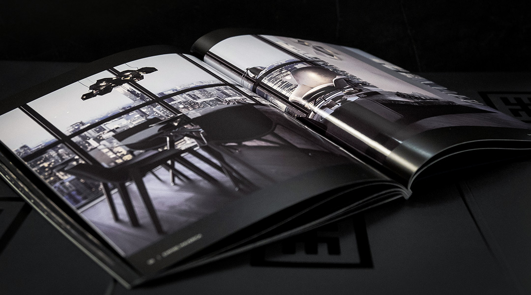
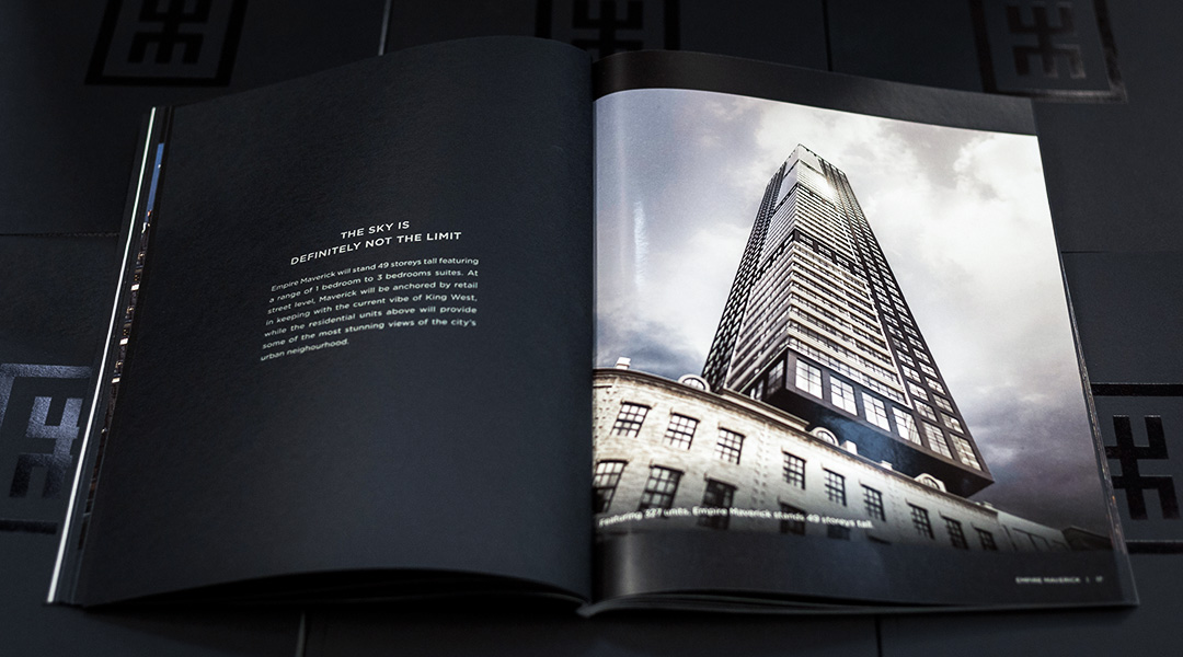
A Stunning Brochure
The award-winning brochure featured various high-end finishes including UV treatments, varnishes, and metallic Pantone inks. The pages were bound between two custom branded fly sheets and a midnight black cover with 3-section hot foils on the front, back, and spine of the book.
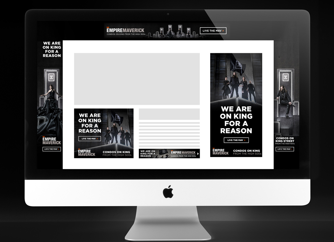
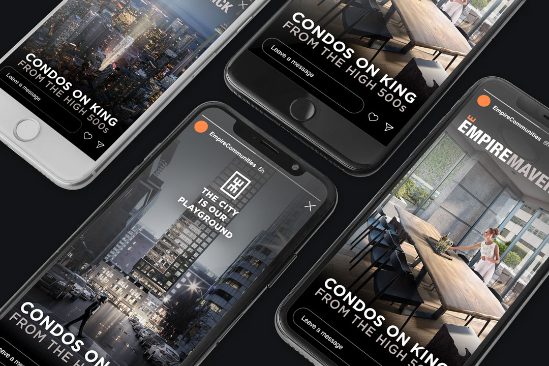
Impactful Advertising
Numerous traditional and modern advertising channels were leveraged to extend the project's advertising reach to the largest possible audience. Digital ads, website takeovers, traditional print ads, and retargeting ad series featuring both product and lifestyle marketing were used to further garner and qualify potential leads.

An Exclusive Event Series
Partnering with Toronto Life, an engaging and exclusive event series was created to give Toronto tastemakers a glimpse into life at Maverick. With the inclusion of the project's Social Club, "The Mav", the events were a sneak peek at what was to come for Maverick residents.
An Award-Winning Campaign
Across the digital, real estate development, and creative marketing spaces, the Maverick campaign has garnered over 35 awards for excellence in various creative disciplines.
Close ⤫Citified Atlanta
Branding, Identity, Editorial

Citified Atlanta
Branding & Identity, Iconography, Editorial Magazine
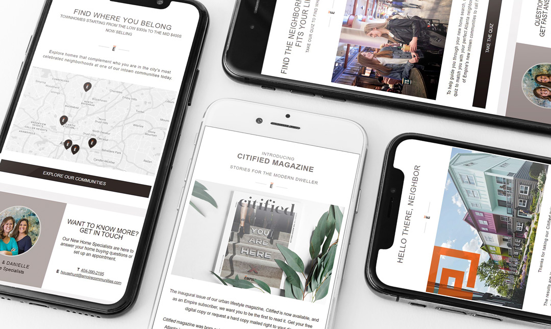
The Citified magazine was created as an extension of real estate developer Empire Communities' lifestyle and living sub-brand "Everyday Beautiful", as the builder's introduction to the Intown Atlanta housing market. With a focus on sophisticated and modern urban living, the Citified mag showcases key Atlanta neighbourhoods, hot spots, and events, giving a snapshot of life in these culturally rich historic areas.
Read the Mag ➞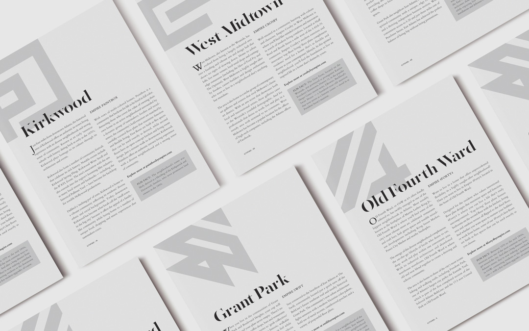
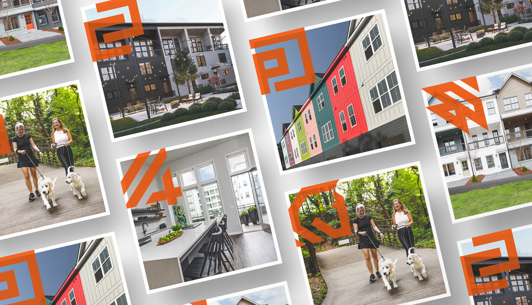
The Iconography
The vision for the Intown brand package was to have a series of icons that convey a strong, bold personality with an almost industrial undertone. With a nod to utilitarian, brutalist design, each community's icon was forged with an urban flare, bold styling and an impactful first impression representing the locations of the developments, their names, and their history. Explorations in patterns, letters, numbers and shapes led the way to this award-winning set of logo forms that are identifiable and bold, bolstering the community brands in an elegant way whilst tying the identity back to the roots of the projects and their history within the Intown Atlanta neighbourhoods.

 Close ⤫
Maven
Branding, Marketing Campaign
Empire Maven
Branding, Identity, Marketing Campaign
Maven is real estate developer Empire Communities' premiere mid-rise condominium project located in Toronto's Yorkdale neighbourhood. With a vision of offering luxurious, boutique suites to affluent individuals living in the surrounding area, the Maven brand was created with special attention given to exuding an elevated, modern sense of sophistication through thoughtful design elements and stylistic choices.
The Book
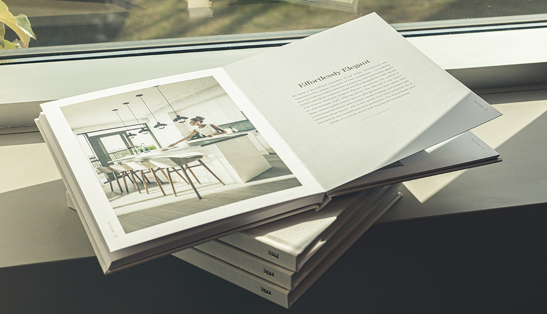
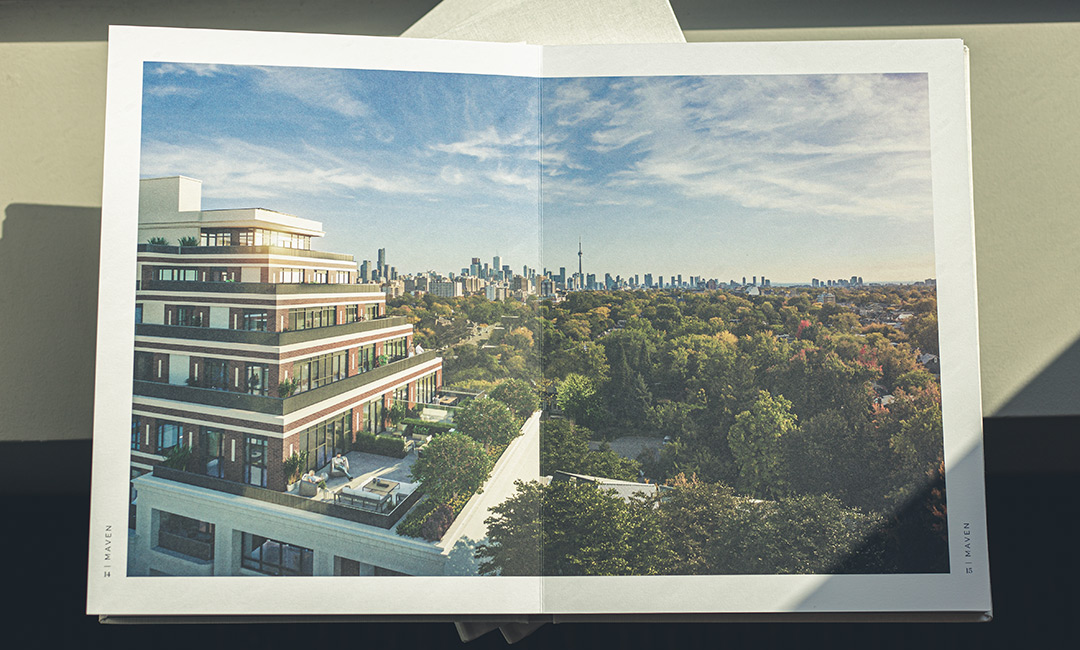
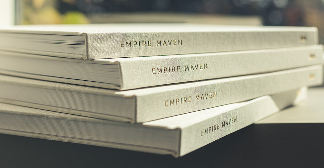
The centerpiece of the Maven brand and the sales experience is the community brochure. Designed in the style of a coffee table book, the brochure represents the longevity of the project and becomes a beautiful item for owners to incorporate into their new home.

Expert finishes including a gold stamped, linen wrapped hardcover adorn the flat-lay mounted pages within. The custom binding allows uninterrupted display of gorgeous imagery with elegant layouts of tasteful typographic treatment.


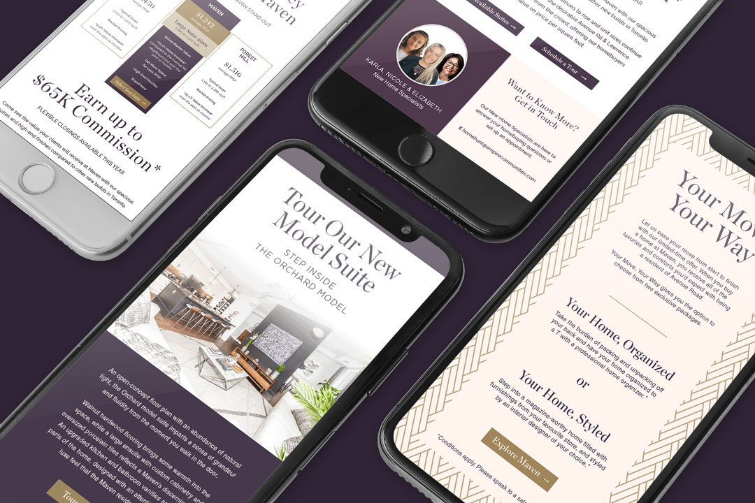
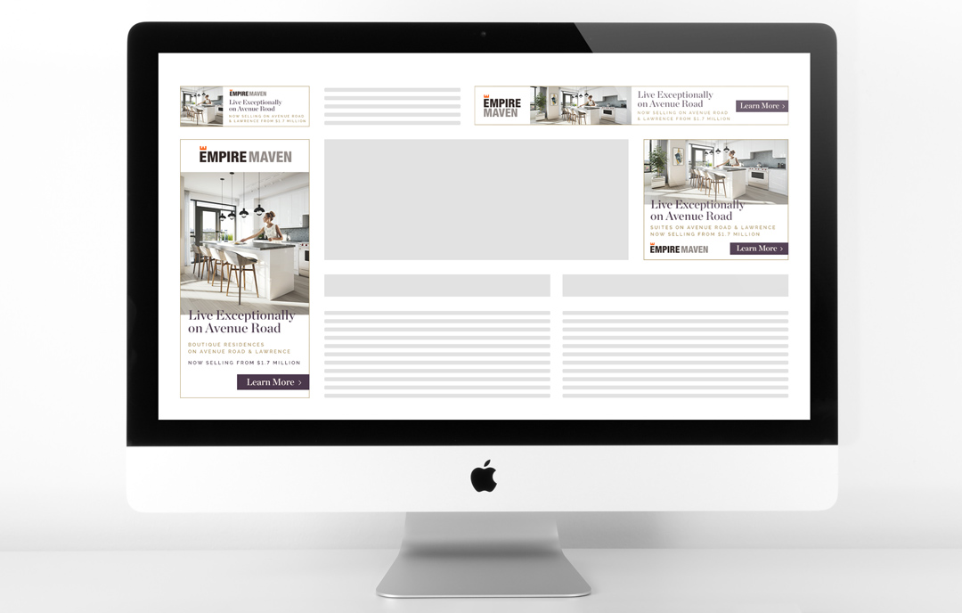
The Marketing
The marketing collateral and communication touchpoints echo the sophisticated design of the Maven brand. With elegant typography and a refined colour palette of royal purples and rich golds, the brand became a unified identity that resonated with the clientele of the project.
 Close ⤫